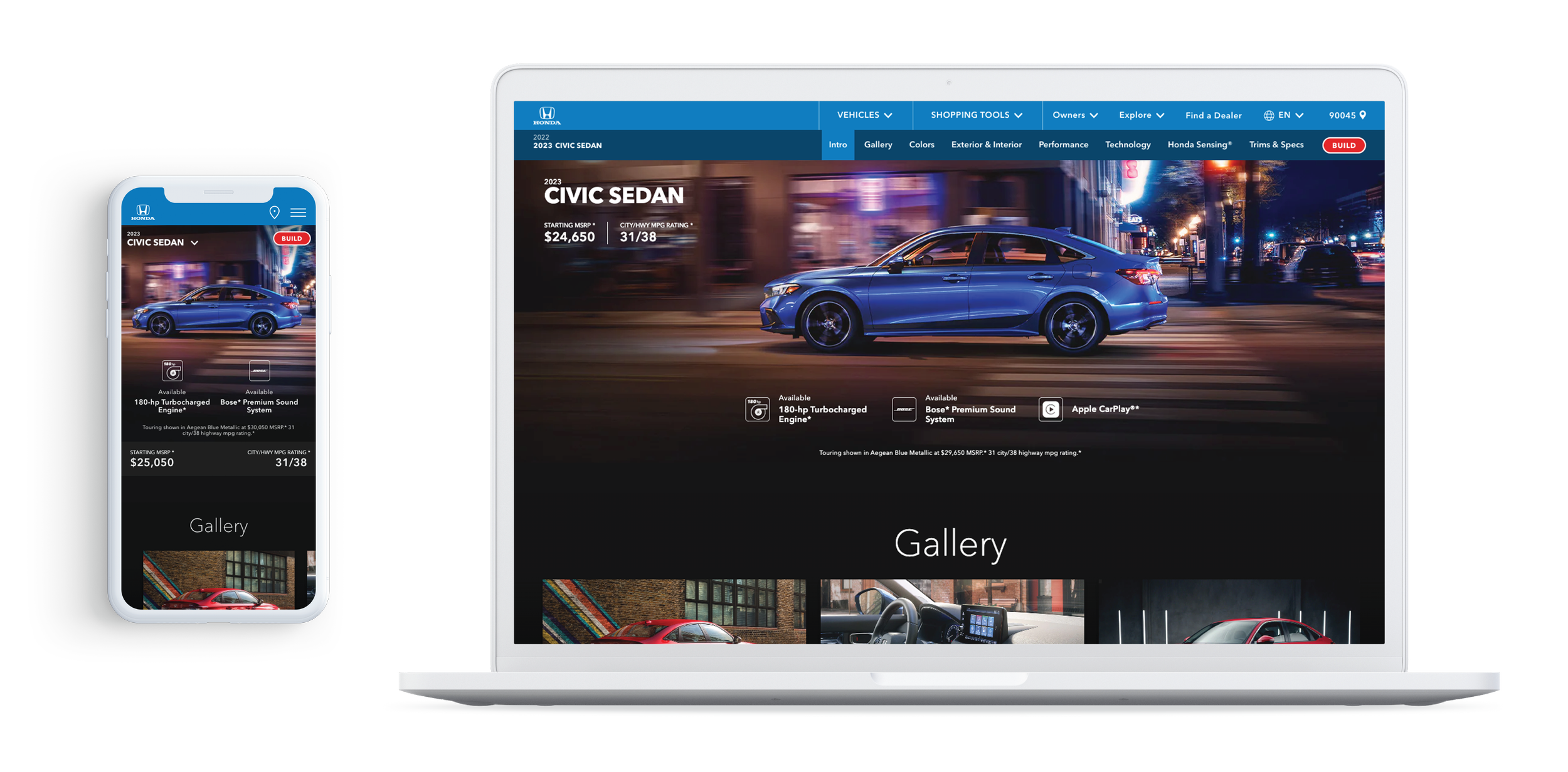
The Vehicle Landing Page hero is the first introduction a potential buyer has to a vehicle. I helped improve the UI design.
Overview
CHALLENEGE
The Vehicle Landing Page hero needs to entice users enough to get them to keep scrolling down the page. The redesign should feature important highlights, captivating imagery, and have room for an offer - all while maintaining a clean design.
THE CLIENT
Honda Automobiles
MY ROLE
UI Design, Art Direction, Prototyping
TOOLS
Figma, Sketch, Principle, Invision
SOLUTION
Accolades and offers are displayed up front
Captivating imagery and video to draw users in
Hero falls above fold so other information can be displayed on landing
01. Problem
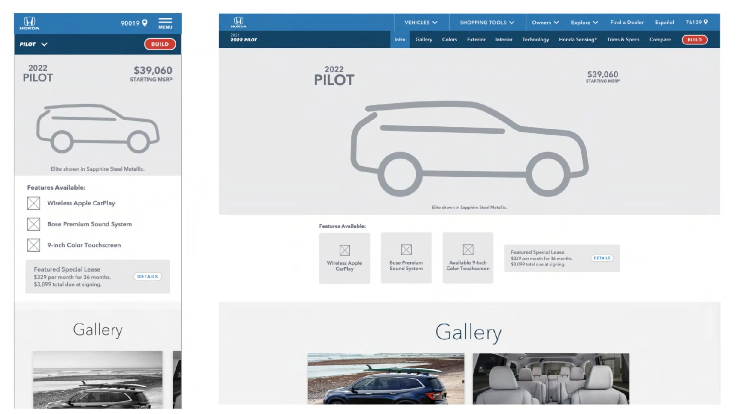
The VLP (Vehicle Landing Page) hero did not make full use of the space it was taking up. The hero was tall and often extending past the viewport, without offering any useful details of the vehicle.
THE GOALS
Add a place to highlight the vehicle’s features
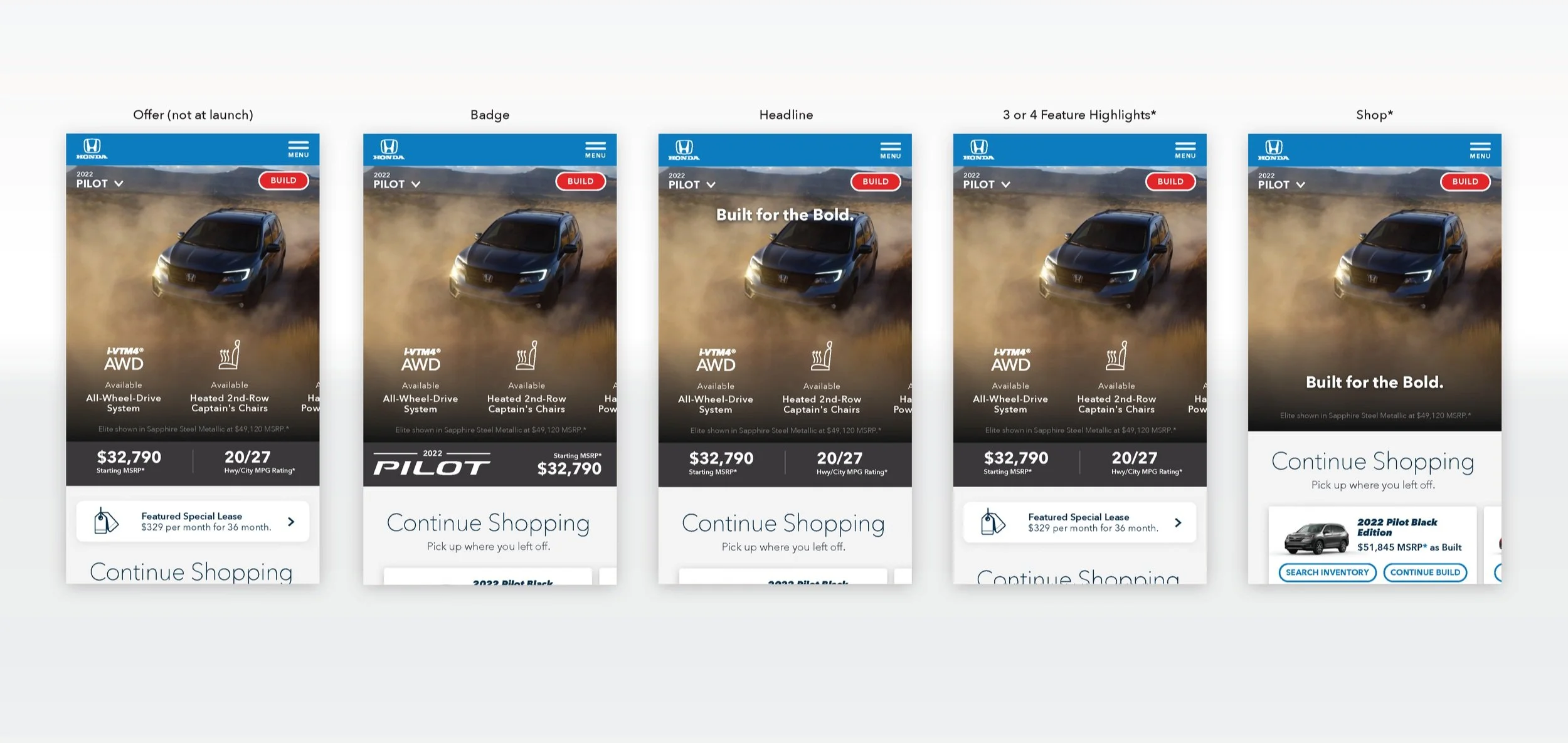
Seamlessly incorporate an offer
Refresh the visual design
02. Insights & Exploration
The VLP proved to be a challenge with the amount of information that needed to fit into a small space. There were multiple rounds and pressure testing the design to make sure everything could fit, while still looking sleek.
Strike a balance between the imagery and featured highlights working together
We need to draw the user in initially with an image and make them want to learn more after reading the features
03. Solution
The featured highlights live on top of the image. This allows potential buyers to view a vehicle’s accolades without it distracting from the captivating imagery.
On mobile a dark grey bar was added below the image where the MSRP, MPG, or offer live. We wanted to leave this where it was on the live site so it’d still be in a familiar place, but updated the design styling to be more neutral and not as distracting.
WHAT I LEARNED
There are endless ways to display the same information. Ultimately, we wanted to create something that was refreshing and let the imagery shine through, while also giving the user a snapshot of a vehicle’s strengths.
Art Director / UX design: Maya Karel
UX Director: Dan Sok
ACD: Leo Arroyo
VP Creative Director: Cris Strittmatter
Agency: RPA Advertising
Honda: Current Offers
Honda’s Current Offers tool allows users to view all vehicle’s available offers. I helped redesign the user experience and visuals.
ESOES App Design
An app designed to help find trustworthy contractors for any emergency. I created the UX/UI design.


