Redefining and showcasing Honda Automobile’s online experience. I worked on the UX/UI and visual design.
Overview
CHALLENEGE
Honda needed a homepage redesign that improves user experience to drive engagement consideration and purchase. It also required seamless navigation for both new and returning customers.
THE CLIENT
Honda Automobiles
MY ROLE
UX / UI Design, Art Direction, Prototyping
TOOLS
Figma, Sketch, Principle, Invision, Illustrator, Photoshop
SOLUTION
Redesigned the homepage to meet both the business and user goals
Refreshed and redefined the Honda Autos branding
01. Research
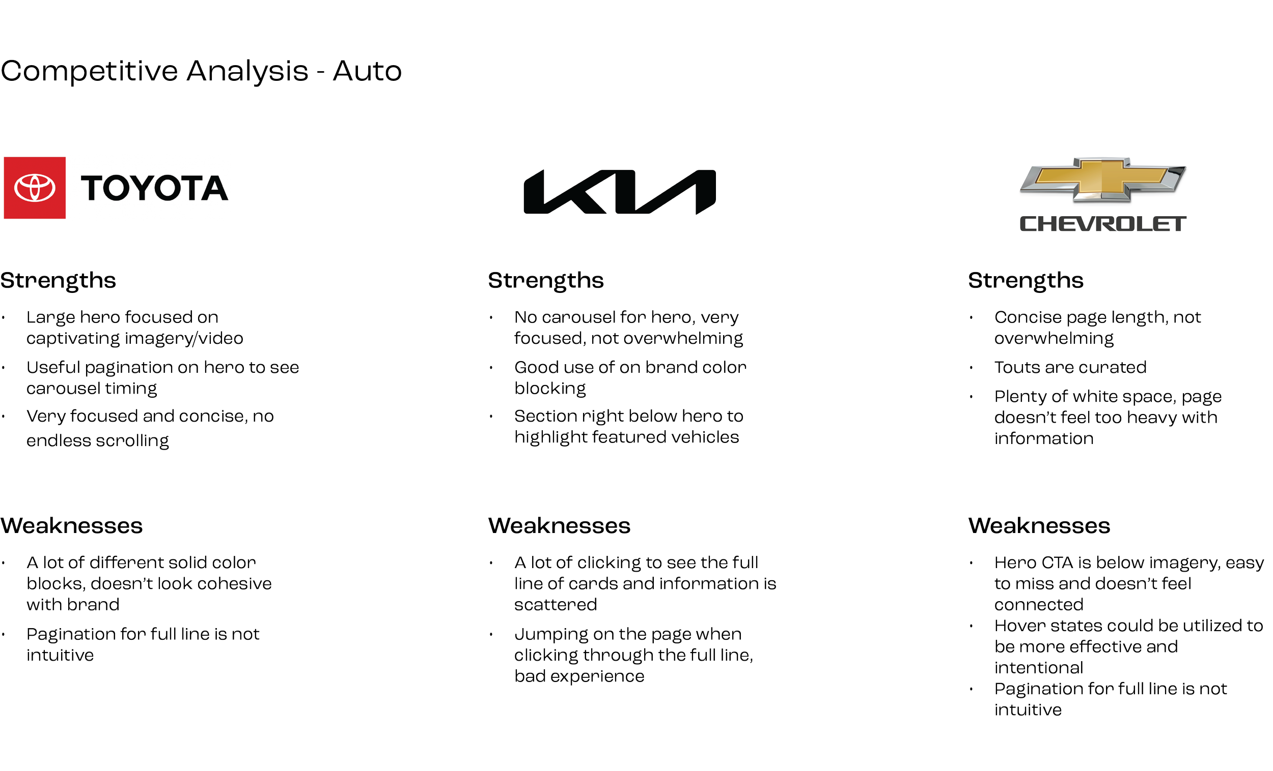
To begin this project, I wanted to understand what users look for and need in a website’s homepage. I wanted to uncover what information would be most effective to display and ensure that the updates for the UX/UI on the redesign are up to industry standard.
Through the research, the goal was to:
Identify competitors and evaluate strengths and weaknesses
Understand both the automotive and other industry homepage trends
Discover the typical content that is displayed on a website’s homepage
USER INSIGHTS
It was uncovered that user’s wanted:
The page to be familiar, but spark curiosity to explore. The visitor rate was almost split between 47% new visitors and 53% returning visitor
Honda customers are looking for simple, intuitive, and elegant experiences
The components that had the best engagement were full line up of cars, hero, and shopping tool belt.
02. Define & Ideate
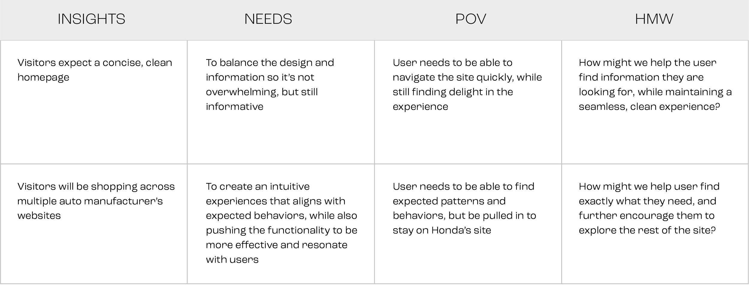
With a better understanding of what a user might be looking to find on a homepage. I created point-of-view (POV) statements and How Might We (HMW) questions to help define and shape the user’s experience.
I then turned to journey mapping, to put myself in our user’s situation, to see what pain points and opportunities arose from that excercise.
BRAINSTORMING
During journey mapping, I uncovered a lot of potential opportunities that were important to think about during the design phase. I wanted to brainstorm how to address the primary How Might We question, while synthesizing the opportunities that were recently discovered.
How might we help user find exactly what they need, and further encourage them to further explore the rest of the site?
GOALS
Create a design that feels familiar to returning visitors, while also pulling in industry standard functionality and design.
The UX should be clean and easy to navigate so our users can quickly navigate and locate exactly what they are needing.
03. Prototype & Test
During the wireframe phase we took time to fully explore each component. I’m going to be focusing on the full line up component to give a full perspective of how it evolved from the wireframe phase into the high fidelity design.
The full line up is one of the most important components because it introduces users to every Honda vehicle.
WIREFRAMES
During the wireframe phase, there were multiple explorations of how to showcase the vehicles. Client asked to see what it would look like if we included accolades/awards for each vehicle.
The first solution utilized a hover state. Not having the accolades in view on default was in effort to keep the page looking clean and simple. But, if a user was interested in a vehicle they would be able to hover over it and see the featured accolades and CTA’s.
The second solution shared the same mobile approach, but on desktop the model in the first slot would enlarge and show that vehicle’s accolades. The issue we found with this one is that it was difficult for user to quickly navigate and see all the vehicles in a section.
HIGH FIDELITY DESIGNS
As you can see below, the full line followed more of the first solution’s approach with multiple models in view. We discovered that accolades were not necessary since they were becoming redundant, because if a user clicked the primary CTA, they would immediately see those same accolades featured in the here. Instead we wanted to entice user with a bold headline to draw them in to wanting to learn more about the vehicle.
Overall, the design was elevated to keep the core essence of Honda Automobiles, while incorporating a more modern feel with bold colors, sleek interactions, and a luxurious look-and-feel.
WHAT I LEARNED
I learned it’s important to lean into what a brand is known for a has, but elevate it to the standard of current UX/UI and visual design. A redesign shouldn’t entirely strip the essence of a brand, but instead help enhance it.
Moving forward I will always understand that history of a brand and the core values before jumping right into the redesign.
Art Director / UX design: Maya Karel
ACD: Leo Arroyo
Senior UX Design: Karen Wang
UX Director: Dan Sok
VP Creative Director: Liz Cordingley
Agency: RPA Advertising
Honda: Current Offers
Honda’s Current Offers tool allows users to view all vehicle’s available offers. I helped redesign the user experience and visuals.
ESOES App Design
An app designed to help find trustworthy contractors for any emergency. I created the UX/UI design.


