An app designed to help find trustworthy contractors for any emergency. I created the UX/UI design.
THE TASK
Design a new app for an end-to-end contractor service experience.
CHALLENEGE
There are apps that are available for maintenance services, however, it does not offer 24/7 services and people are skeptical if contractors will actually show up or will do the job well.
Overview
SOLUTION
User can feel more confident when looking for a potential contractor
End-to-end experience where the initial contact to payment is all through the app
MY ROLE
UX/UI Design, Art Direction, Prototyping
TOOLS
Figma, Sketch, Principle, Invision
01. Research
Researching included doing research on competitors and gathering how users resonated the services. Interviewing people who are homeowners and analyzing forums where people were looking for contract work. And based on that, journey mapping a users actions, pain points, and opportunities.
COMPETITIVE ANALYSIS
There are multiple apps on the market that offer contract services. But, none of them offered 24/7 services in an emergency. Also, the reviews were not positive and there were a lot of issues surrounding dependability on both the contractor and customer sides.
The main takeaway, was using the same layout, but adding additional safety measures and a way to say that contractors are available 24/7.

INTERVIEWS
Questions:
How do you find services such as electrician, locksmith, etc.?
What types of services do you most frequently need, and how easy is it to get in contact with someone who can fulfill your request quickly?
Describe what you look for to create trust for someone coming into your home.
Describe your latest experience using an app to hire someone. Or the last experience you had using a contractor.
In-Person & Review/Forum Key Findings
Frustrated that many contractors were flakey or booked on larger projects with no time for smaller tasks
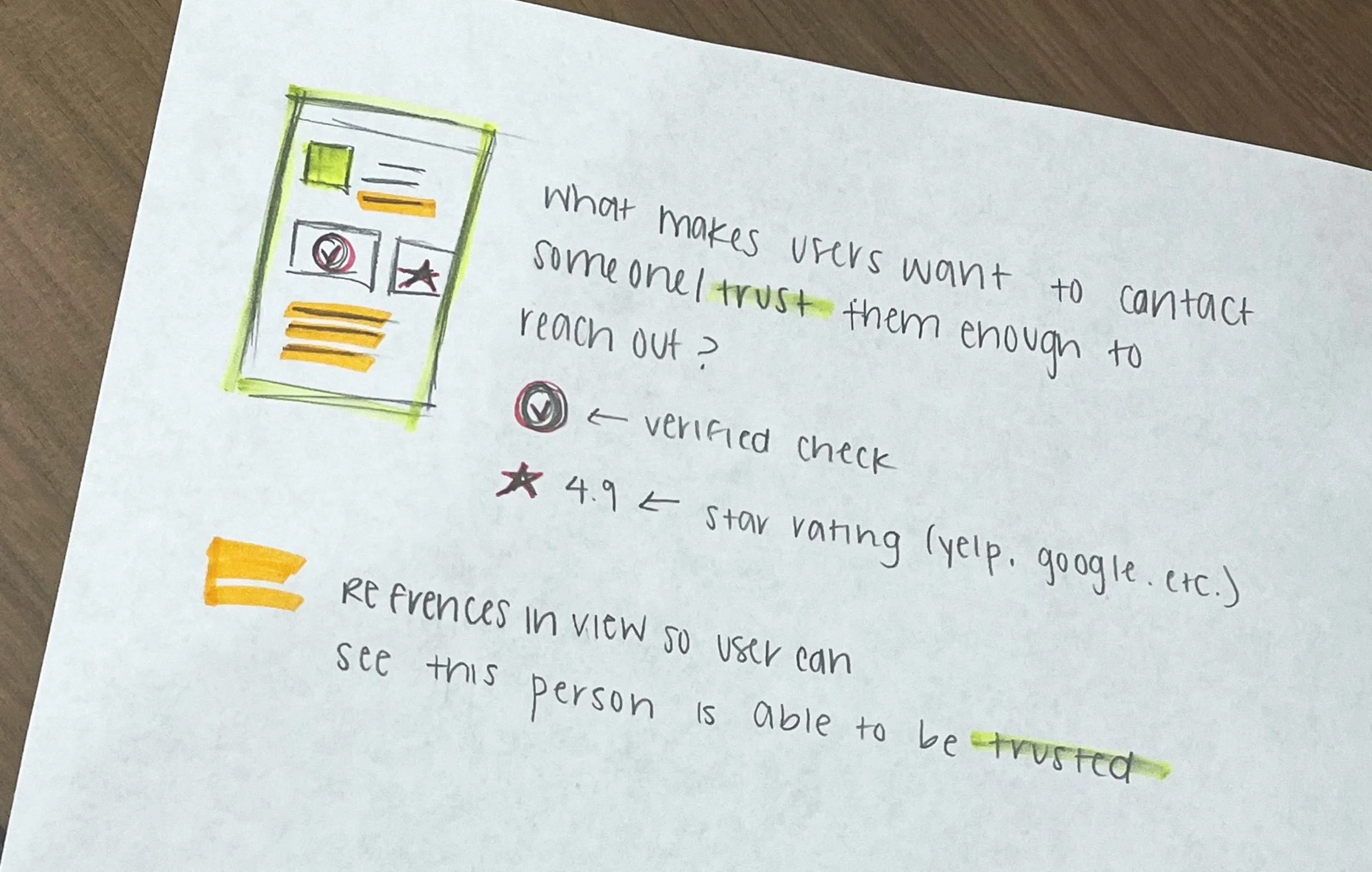
Ratings are the most important to help identify who they are going to hire and trust going into their house
Lack of customer service on the apps end so if there was an issue there was no one to contact
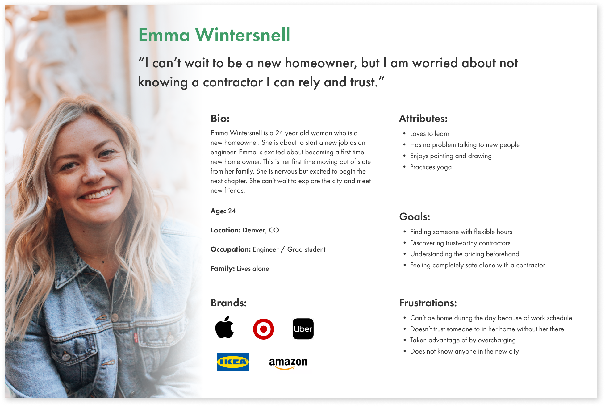
PERSONAS
Main Takeaways
Users want to find people who can work around their schedule
Find contractors they can trust
Eliminate the possibility of being overcharged or surprise fees after the job is complete
Find contractors who are professional and proficient knowledge
JOURNEY MAPPING
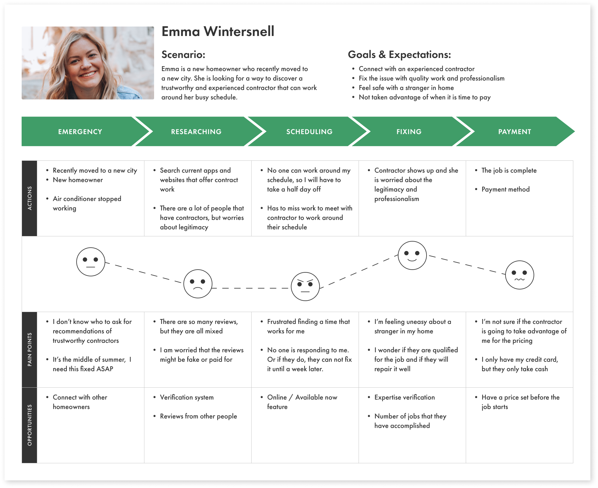
While creating a journey map I began to understand and find the pain points that a user experiences when having to go through the process of finding someone to fix something, especially in an emergency.
The entire process was painful from discovering the emergency to being unsure if the person was being overcharged
The user will have to give up their time during their work day to make sure they are there when the contractor arrive
POINT OF VIEWS (POVS)
Homeowners need a way to verify the legitimacy of contractors because they want to trust who is coming into their home .
Homeowners want to be confident in the work that the contractor is doing is correct and done well.
Homeowners desire a contractor that has flexible hours or can be there in an emergency situation right away.
02. DEFINE & IDEATE
How might we…
... provide homeowners with a way to feel safe
... verify the experience & professionalism of contractors
... screen for reliable contractors that will show up on time and complete all the tasks
... give consumers a system to feel confident they can trust the contractor’s ability to properly do the job
... help homeowners connect with contractors that they can immediately trust and feel comfortable with
DESIGN CONCEPTS
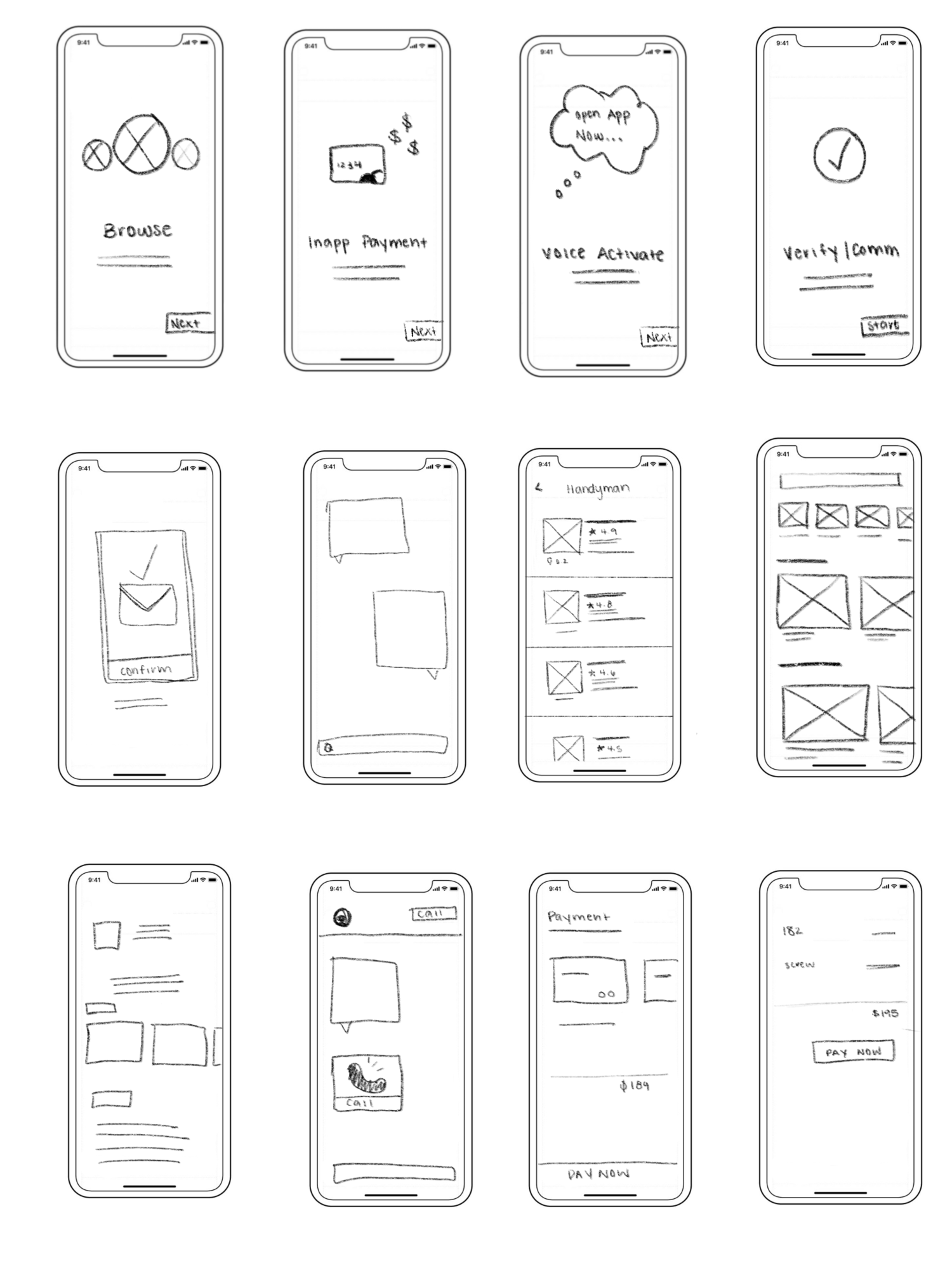
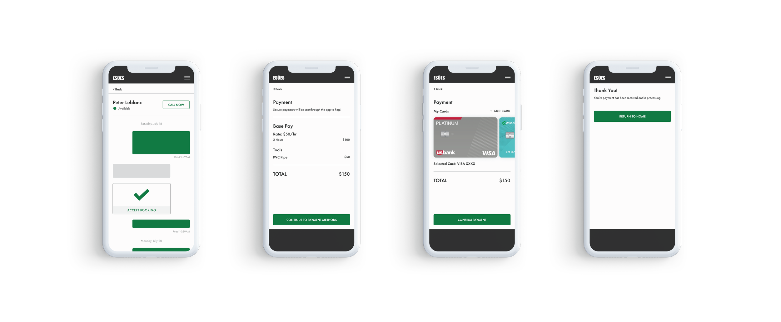
For the user and the contractor to both agree on booking and job requests quickly, the transaction would be done in the messaging feature. Doing this creates a quick system for the user to simply click a button that accepts the job. The app now has records that this contractor was booked and the user was able to do it quickly, which is especially important in an emergency situation. The payment was also added in the messaging feature which eliminates any clunky and extra screens for the user.
In terms of references, a concern that was brought to my attention was making sure that the references remain anonymous to be comfortable stating their honest opinion. To solve this I decided that the users only show their first name and last initial, or opt to only show a username.
Main Focus
Extra measures to ensure that users feel they can trust who they are choosing to hire
Simple way to communicate when contractor is available to answer work order right away
Ensure users know the hourly fee upfront and are not charged any hidden fees once the job is complete
WIREFRAMING
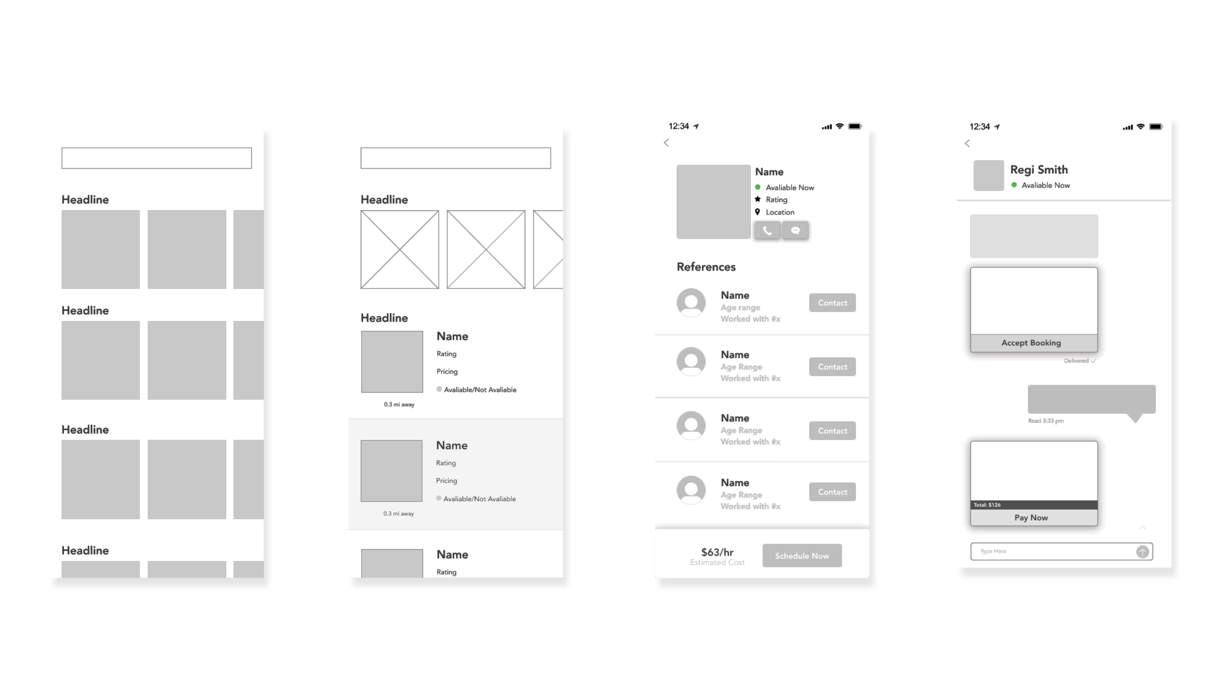
During the wireframing stage, I wanted to make sure that I explored multiple layouts of the homepage and how the hierarchy would work. The two homepages (first to on the left) did not end up making the high fidelity part because there was no hierarchy and it looked monotonous. I redesigned it to have a large part of the emergency services the biggest.
PROBLEMS
For the user and the contractor to both agree on booking and job requests quickly, the transaction would be done in the messaging feature. Doing this creates a quick system for the user to simply click a button that accepts the job. The app now has records that this contractor was booked and the user was able to do it quickly, which is especially important in an emergency situation. The payment was also added in the messaging feature which eliminates any clunky and extra screens for the user.
In terms of references, a concern that was brought to my attention was making sure that the references remain anonymous to be comfortable stating their honest opinion. To solve this I decided that the users only show their first name and last initial, or opt to only show a username.
To Summarize
Need a way for both the user and the contractor to see that there was a booking and job request
Develop a way for the user to pay within the app and fit that logically within the journey
Be able to contact references, but maintain user confidentiality
03. PROTOTYPE
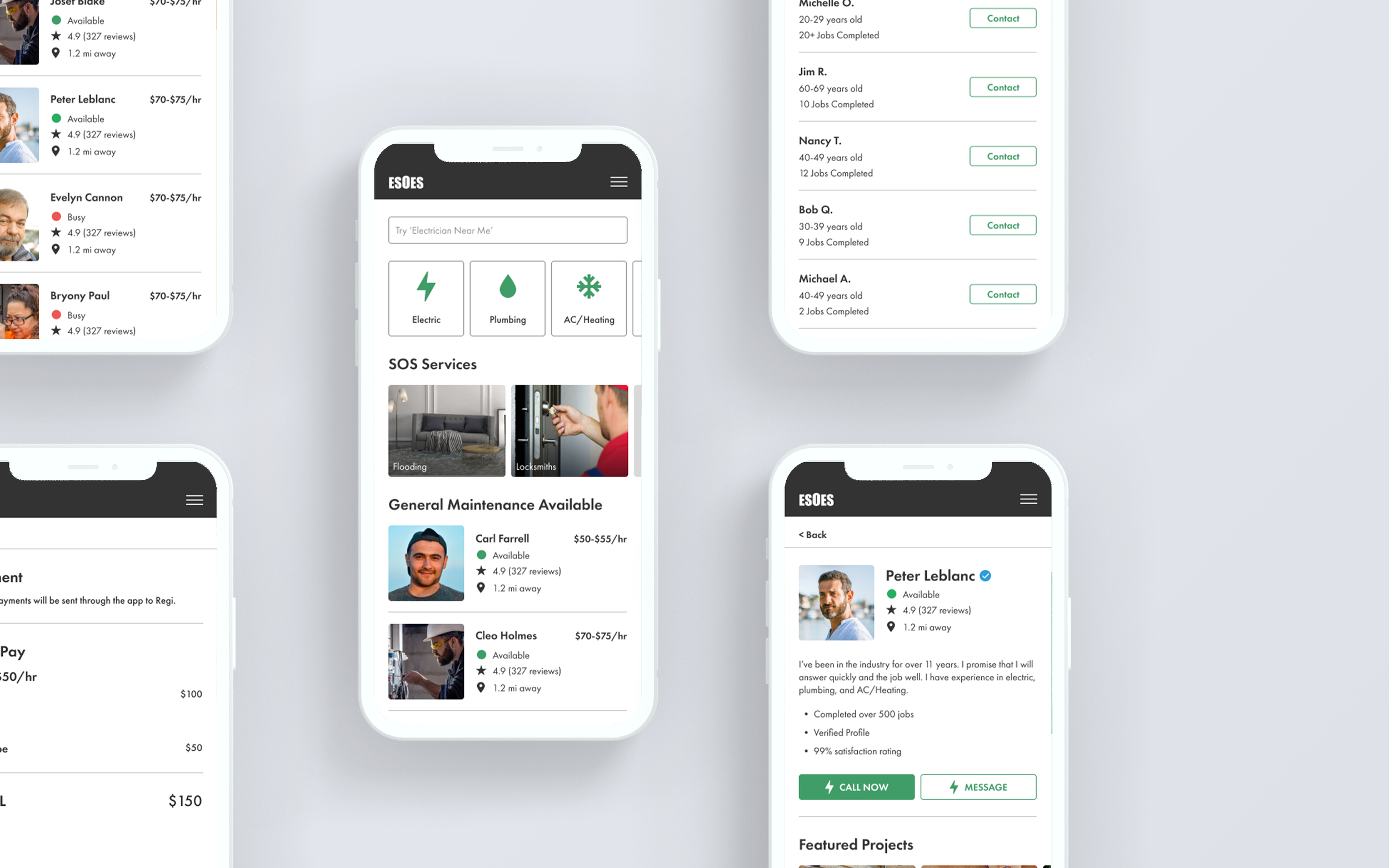
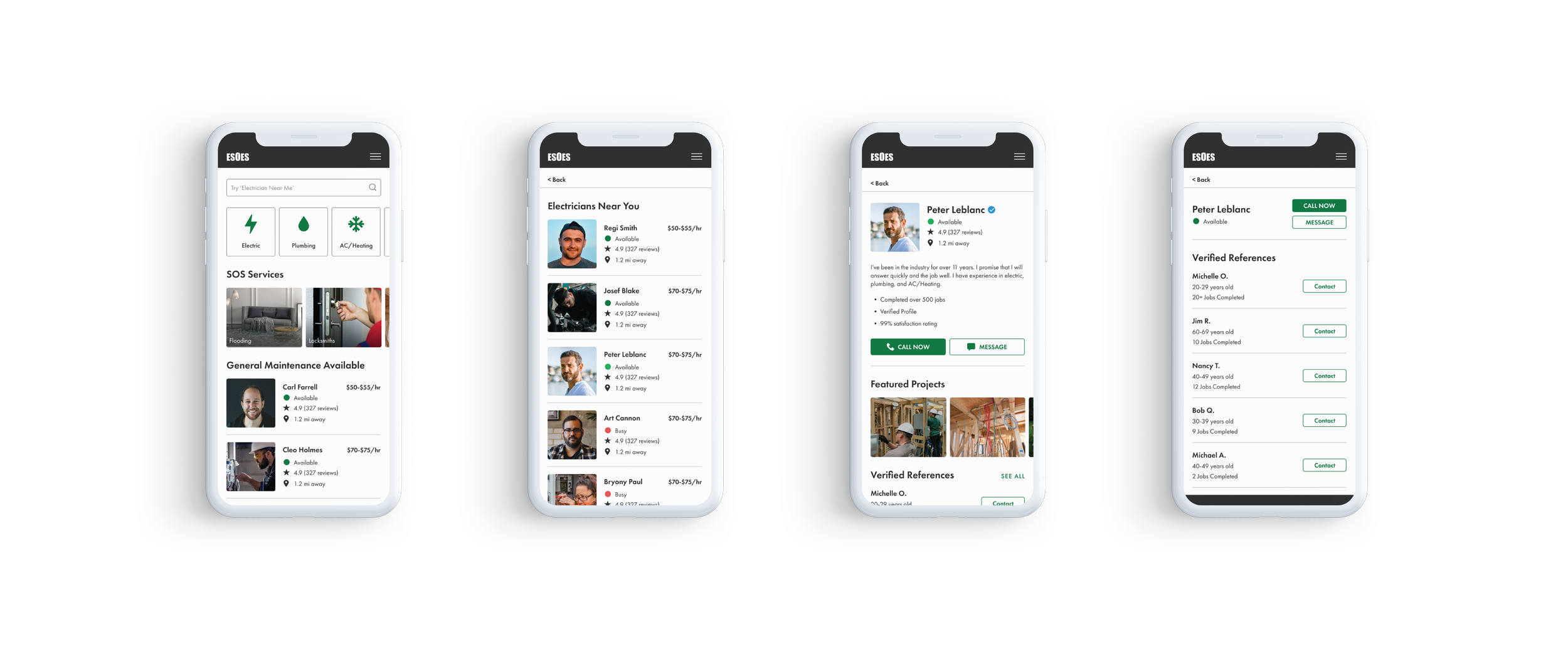
After sketching out my ideas, I started to design the main screens of the app. During the wire phase I initially was exploring a lot of large images on the landing page, however it lacked hierarchy. The final screen has tiles that display common services, which allows user to quickly find a service they may need. Right below that, as the largest image, are SOS services.
I also fully fleshed out what the payment screens would look like. This was important because during my research, one of the concerns was users want to know how much to expect up front with no hidden fees. I included a screen that shows the breakdown of payment so user’s understand what they are paying for.
WHAT I LEARNED
Designs should be intuitive and put the user first in every situation. The entire process from becoming a new homeowner, needing something fixed immediately, having to find a trustworthy contractor is very stressful. Creating a seamless experience from start to finish will help the user relax, and in turn gain more trust and confidence in the provided service.


