Honda’s Current Offers tool allows users to view all vehicle’s available offers. I helped redesign the user experience and visuals.
Overview
CHALLENGE
The Current Offers tool should be redesigned to allow users to easily find, sort, and filter offers across all vehicles.
Users should be able to view multiple offers upon landing and be encouraged to contact their local dealership at the end of the journey.
THE CLIENT
Honda Automobiles
MY ROLE
UX/UI Design, Art Direction, Prototyping
TOOLS
Figma, Sketch, Principle, Invision
SOLUTION
User can confidently explore and select offers
Aligned functionality with other site behaviors
Streamlined process for user to connect with dealership
01. Research
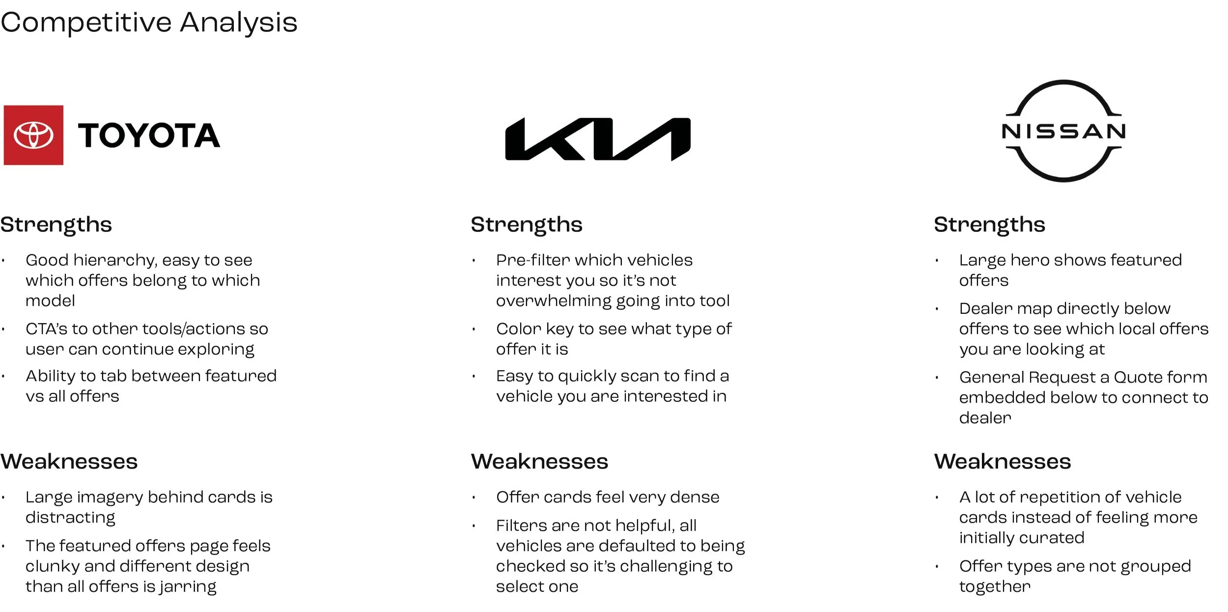
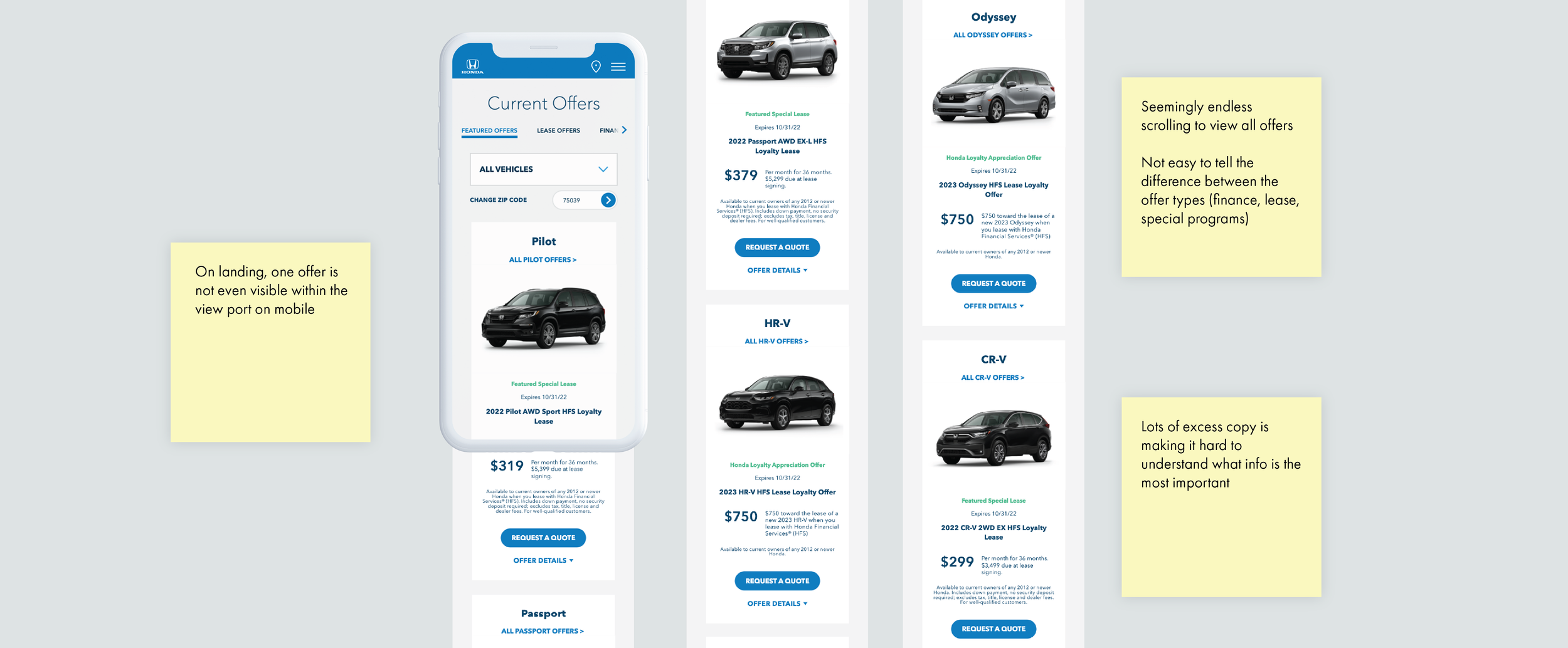
To begin this project, I conducted a competitive analysis on other automobile manufacturer’s Current Offers tools. I then turned to Honda’s Current Offers page to audit the experience so I could understanding the immediate pain points.
Through this research, the goal was to:
Understand the major pain points of the current design and functionality
Identify the strengths and weaknesses of competitors
After reviewing Honda’s direct competitors and conducting an audit on the current tool, there were three main takeaways.
The number of offers seen in a viewport needed to drastically increase, especially on mobile
Overall, the functionality and design should align with Honda’s current system, while finding opportunities to make improvements
There isn’t a standard for how offers are displayed in the auto industry, but the competitor pages that are working best have very distinct hierarchy so the offer can be easily processed
SUMMARY
02. Define and Ideate
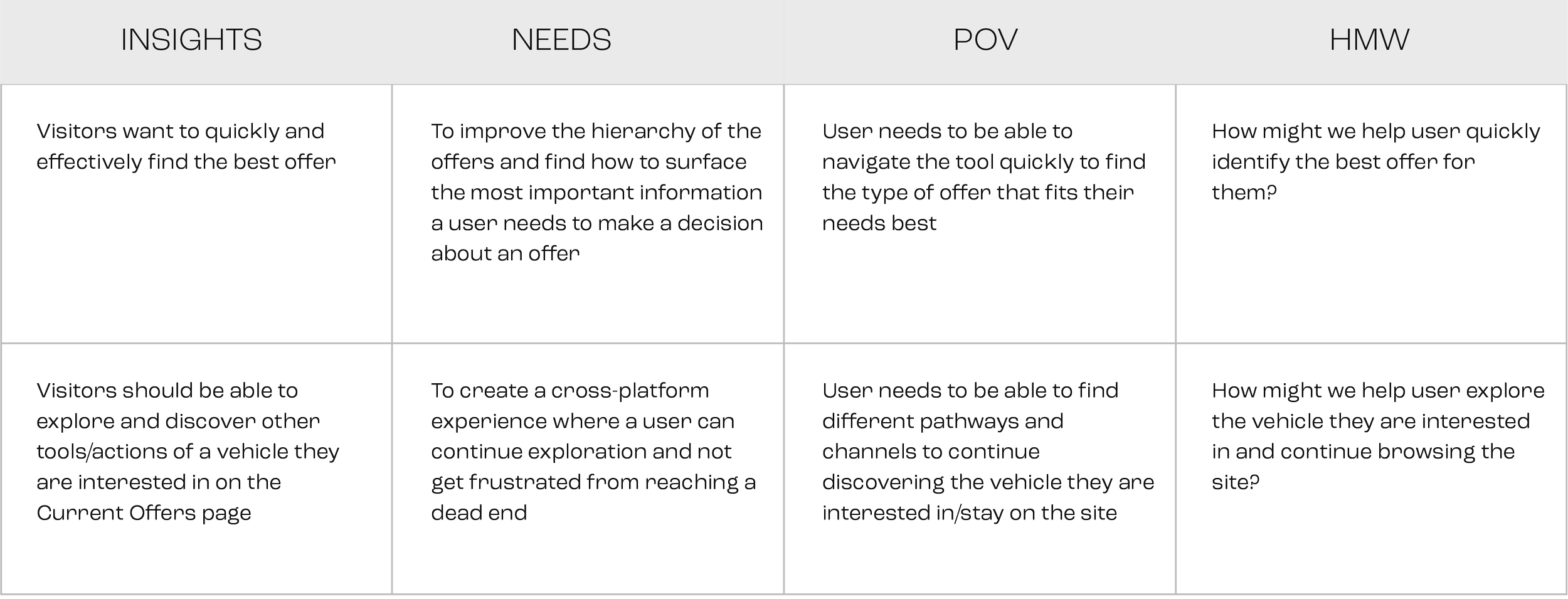
During this phase, I begin with point-of-view (POV) statements and How Might We (HMW) questions, to synthesize what was learned from the research.
I then created a journey map to immerse myself in our user’s experience and identified key pain points and potential opportunities.
I then started to brainstorm and created a mind map to synthesize the HMW questions, with the potential opportunities discovered during the journey mapping.
How might we help user quickly identify the best offer for them?
BRAINSTORMING
I started the wireframe phase with two main goals in mind:
1. Maximize the offers and vehicles displayed on landing
Users should be able to easily locate vehicles and offers. The client and incentives also requested that the design be flexible enough to reorder the vehicles based on business priority.
2. Allow users to discover other vehicle offers or further explore of the site
We did not want potential customers to drop off the site completely if they lost interest in offers. To combat that issue, we needed to find a way that allowed users to continue exploration of the site and vehicle.
WIREFRAMING
The image above shows the initial wireframe iterations for the offers landing page. We collaborated with the legal team and were able to relocate a majority of the legal copy to either a disclaimer functionality or on the request a quote form. With the copy trimmed down, the vehicle offer cards were designed more compact and stacked side-by-side. Doing this quadrupled the number of offers in view on the mobile breakpoint.
Furthermore, the offer card needed to serve two purposes. The first to take the the user to view all of a vehicle’s offers. The second to display a vehicle’s featured offer. Two distinct tap areas were created to lead to either of these paths.
The vehicle specific offers page contains all the offers associated with a single vehicle. Towards the bottom of the page, an “Explore More” section was added that includes CTA’s linking out to other shopping tools on the site. This is in effort to encourage the user to continue browsing the site.
Additionally, the section “Similar Vehicles” displays offer cards of models that have the same body type. These two sections allow users to continue exploring both the tool and the site as whole.
03. Prototyping
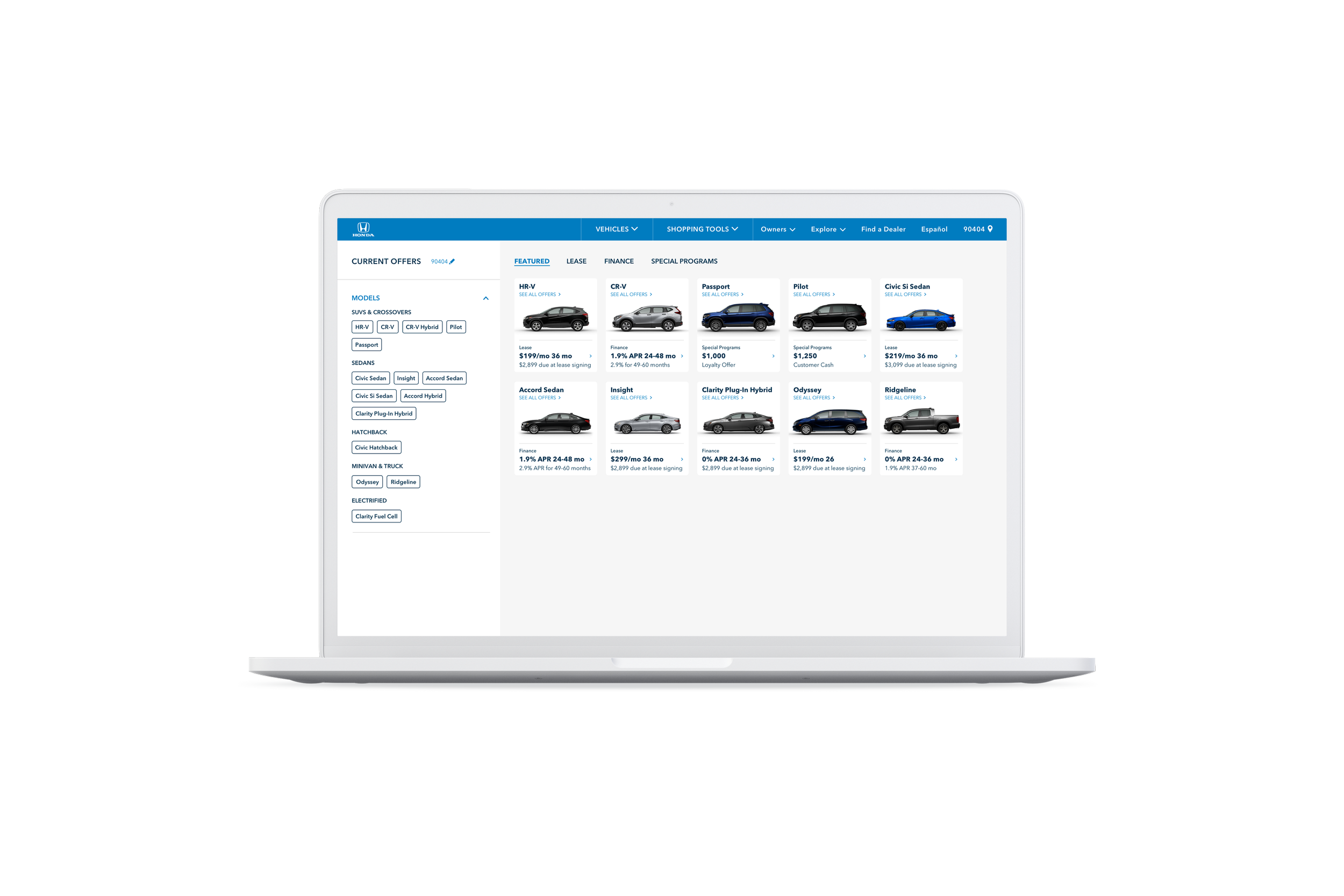
We successfully redesigned Current Offers so that a user can now confidently explore and identify which offer suits their needs best. Interaction of the tool increased by 200% after launch.
The tool has been updated with a new layout, type style, and behavior. With these changes, users can easily scan and understand what each offer entails, leading to a more streamlined path to contacting a dealership.
WHAT I LEARNED
More is not always better.
It’s easy to add in all the information we think a user may need. But sometimes it’s more harmful than good. Before the redesign you couldn’t see a single offer on the mobile landing page because of all the excess copy. Once we stripped to only the most essential copy it gave users the ability to easily digest the offers.
Art Director / UX design: Maya Karel
UX Director: Dan Sok
ACD: Leo Arroyo
VP Creative Director: Cris Strittmatter
Agency: RPA Advertising
Honda: Vehicle Landing Page Hero
The Vehicle Landing Page hero is the first introduction a potential buyer has to a vehicle. I helped improve the UI design.
ESOES App Design
An app designed to help find trustworthy contractors for any emergency. I created the UX/UI design.


